

Did Kandinsky get it right, or do all artists really want is attention?
The inner need to make art
Georgia O’Keeffe once said somewhere that she considered herself fortunate not to be burdened with a great amount of knowledge. I identified with this with relief, because most of my expertise for teaching art is experiential, not book-learned.
O’Keeffe recommended 2 books, Johannes Itten’s The Art of Color and Wassily Kandinsky’s On the Spiritual In Art. She said not to read Itten’s book, just look at the pictures, and of Kandinsky’s book, read it, but don’t look at the pictures. I found these 2 books particularly helpful in thinking about and doing art, not only with my own art, but in helping others understand and execute their own painting and drawing on a personal level.
One of my required college courses was all about the color pictures in Itten’s book. We simply copied them with tempera paint, painting then cutting out little matching swatches of color and gluing them together in a patchwork potholder design to match each illustration. They are exercises in hue, value and saturation, and I learned much from doing this. It was also eye-opening to see how others interpreted the same colors, when everyone’s works were placed in the chalk tray to lean against the chalkboard next to each other in the front of the class.
And I did buy and read Kandinsky’s book, ignoring the pictures as advised by O’Keeffe. (The pictures in the book were not of his gorgeous abstract paintings, but small black and white woodcuts, which were easy to overlook.)
Kandinsky tried to paint music. He painted according to his “inner need.”
Color separations
I also learned much from working at a local newspaper, designing ads. The print supervisor, Billy, had long scars on his arms from working with hot lead when setting type the old, mechanical way in the old days. He also ran a fishing excursion line on weekends. He was fond of saying that there would always be newspapers, because you couldn’t wrap a fish in a computer.
Billy took me in the back to see the huge web printing press at work. He showed me how separations worked, the long plastic sheets with various dot and line screens that would be used to print out the overlays of color to recreate color photographs. It was a crude, but fascinating process, and I learned that in working with a web press, spot color was the way to go if you wanted to use a color headline.
All the colors of the rainbow were created by the optical mix of 4 individual dot screens assigned each to colors known collectively as CMYK: cyan (primary blue), magenta (primary red), yellow and “key”(black). Black was key, because the paper was printed in mostly black, and the other screens needed to line up with it (this is called “registration”). Exact registration was a difficult thing to achieve with an old workhorse as this huge newspaper press, so purple headlines, for example, would often not be readable, because the magenta and cyan plates used to make this color would not line up exactly. Pictures would not have the same quality as, say, National Geographic, because high quality printing (not on newsprint but shiny paper) demanded a different kind of printing press altogether.
Still, it was thrilling to watch as the blank newsprint ran off the huge paper rolls through the body of this huge mechanical dinosaur, printed both sides and was cut, cranking it all out with a loud, syncopated industrial rhythm as it emptied the buckets of CMYK colors that brought the newspapers to life.
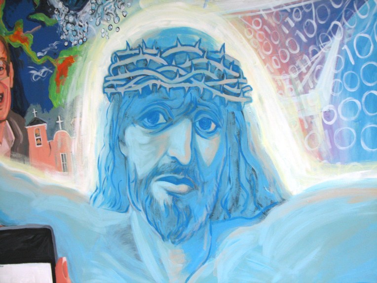
Non-photo blue Christ
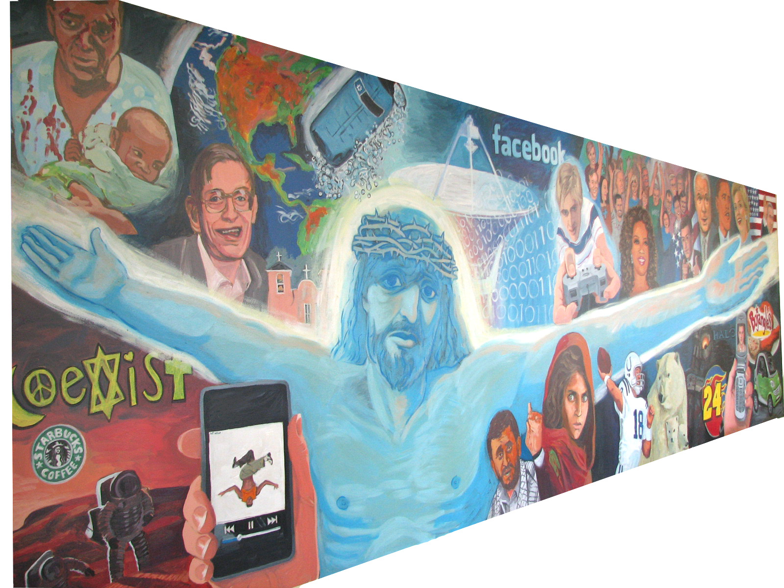
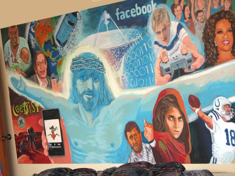
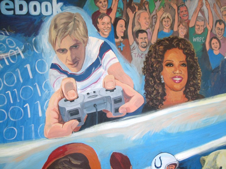
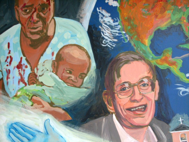
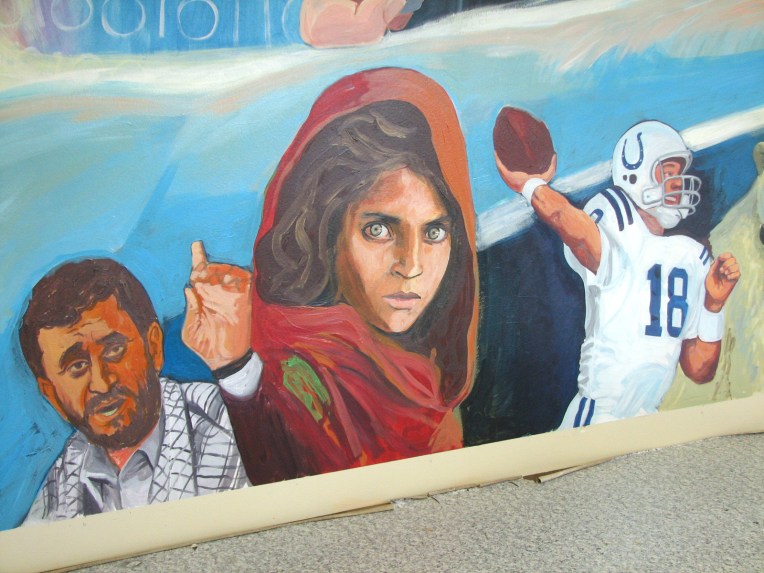
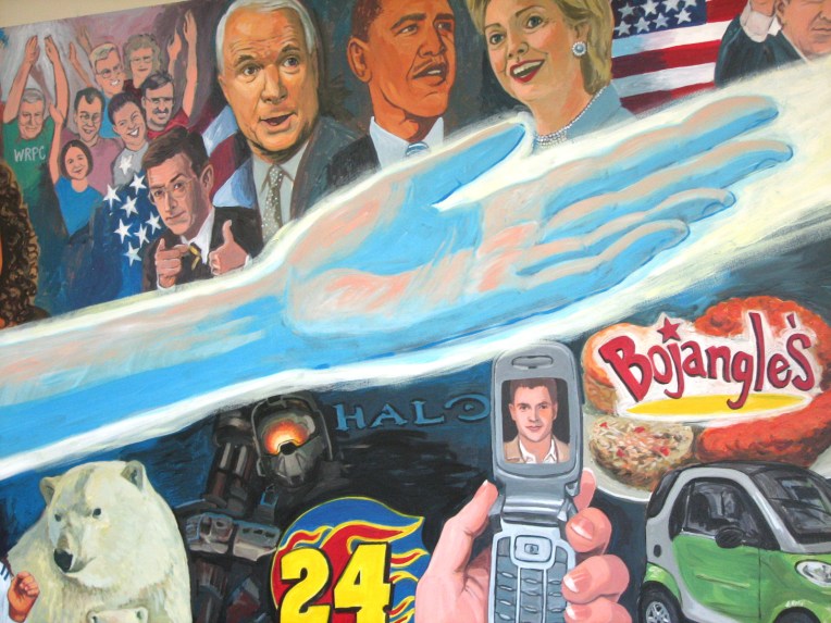
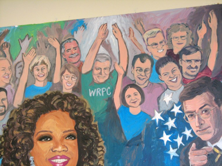
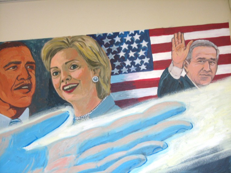
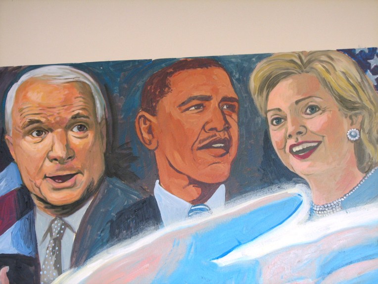
Years later, in 2008 I created a 17’ x 5’ indoor wall mural mixing acrylic CMYK colors. A different process (no dots!), but with surprisingly effective results. I worked with a Presbyterian youth group, and we discussed the things that occupied their minds, and how Christ fit in between all of that. I painted Christ using an approximation of “non-photo blue”, which was a light cyan that avoided detection in the days of reproducing mechanical ink drawings photographically. You would use non-photo blue pencils and pens to draw lines, then ink them in. I thought that a non-photo blue Christ in the midst of all the temporal things that are so sharply inked in our lives might be a nice epistemological contrast.
I also designed the mural so that as you entered the youth room, Christ’s arms would appear to protrude out of the wall, suggesting another, spiritual, dimension.
I’m very grateful to this church for allowing me to paint there, as we had recently moved up to Raleigh, North Carolina to escape Gulf Coast hurricanes. We lived in an apartment, and there was no room to paint.
The inner need
Why do we make art? Is it to be recognized and celebrated as a genius by fickle art critics and the self-obsessed art world? Well, sure, why not! That would be fun!
But seriously, if you look at the work of children, as many a modern artist has, you will find often a purity of intent that lies at the heart of art. When I teach people, regardless of age, I try to be sensitive to their inner need to make art. (Thank you, Kandinsky.)
When I was a kid, I drew horses obsessively. I couldn’t draw people, so I created creatures with horse faces and antennas and ant-like bodies that rode the horses. The horses could fly to other planets without wings. I was most intent on the story, so I would draw for a while in my sketchbook, then tire of drawing and finish it with just writing. I would write letters to God and bury them in the apple orchard. I would not show any of this to people. There are other children (and adults) out there like this, and they are the ones I most enjoy teaching.
What’s easy?
Often I will be asked to provide a drawing exercise that would be “easy.” It became my task to differentiate what is “simple” from what is “easy,” because what is simple might offer the most elegant, and thoughtful solution to a problem, whereas what is easy might just be a rehashing of a process one is already familiar with. “Easy” might be a rumination, whereas “simple” might be a revelation.
Start learning art! I’m there for you.
Benefit from my practical, individualized, and creative approach to learning how to draw and paint using traditional and/or digital media. Offering group and individual instruction for serious art seekers only, from teen to adult.
